|
A scribe comes running and hands the lady, who is still on the platform, another scroll.
"Ladies and gentlemen!" she says, scanning the parchment, "we have the results of the art contest!" She looks up, meeting your eyes. "The title of Runner-Up goes to Tsahraf Chahsid Mimetes for his piece, "Gray, gold dragon, face of malediction, and smoke poem!"
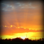
She waits for the applause to quiet. "As the only digital entry, Black Hawk's "Dragon Sunset" receives honourable mention!"
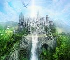
She waits for silence again. "And the announcement you have all been waiting for: the winner of the contest is Dragon Entry 1 by," she pauses, "Lady Eruwaedhiel! Congratulations, and thank you, everyone, for participating!"
She nails the parchment on a nearby wooden column before disappearing in the crowds.
Lady Eruwaedhiel, please contact Fairfeet the Seer to claim your prize!
Judges' comments:
AzlynRose: Very creative idea! The see through wings, face in the background, and smoke truly makes it look 3D. The colours are not quite as eye-catching as Lady E's, but it still is a remarkable piece of art. Watch your strokes just a bit on the background particularly in the sky above the face.
Mistress Rwebhu Kidh:The ideas are stunning, and the transparency of the dragon is done very skillfully. Everything is done skillfully, really. However, the reason I didn't think it was best was because of the overall impression. It left me muddled, without enough contrast of emphasis. When I look at it I find myself trying to figure out what this part is because it is unclear, and then something else will catch my eye that doesn't seem to fit, and so on. There are so many things to look at that the picture isn't as good as it could have been.
Celestria: This piece is off the chart when it comes to creativity with that smoke poem, those see through wings, and that totally creepy face. The only reason I chose it as the runner up and not the winner was that it almost seemed overboard on detail work, distracting rather than adding to the original picture.
AzlynRose: A splendid piece of digital art. I do not have much in the way of critique, because I don't have experience with digital art, but I can tell you what I liked about it! The idea and the colour scheme blend together beautifully, and match the lighting on the dragon. I love the detail on the dragon's wings and the shading on the people and the dragon make this picture look real.
Mistress Rwebhu Kidh:The 3D effect is wonderful. There is more shading on this dragon than any of the others, and it makes the dragon seem very real. The dramatic upward lighting gives it a feeling of being in midair, and of doing something really awesome, whatever it's doing. However that effect in particular is dampened by the lack of cohesiveness with the background, in my opinion. If the sky matched the style of the dragon more and had a little more detail, the dragon would still stand out as the obvious centerpiece but would actually seem like it was flying. Also, I think the dragon would be better with a tiny bit more color variety.
Celestria: Our first ever digital entry in a coloring contest. I would have loved to see more competition in this category. Toothless did a great job with his picture. The texture he gave the dragon wings and body, the shading, the coloring… all were done well and give the picture a vivid 3D appearance. If anything, I feel like he played it safe and would have loved to see a little more creativity especially with the colors.
AzlynRose: The golden wings are the first thing you notice on this dragon, and they instantly caught my eye and drew me into the picture. Your unique idea and the ability to carry it out tells the story of this legendary creature well. The only critique I have is that a little more shading on the dragon and people could make it look more 3D, and to watch the strokes of your pencil while doing the background so that they are not obvious straight strokes.
Mistress Rwebhu Kidh: I love the colors and the way they work together. The picture felt very cohesive and just plain pretty every time I looked at it. I think that the only thing you could have done to make it better would be to add more detail in places, give people something to look at even deeper and further after the overall scheme catches their eye. Putting some light, contrast color veining on the wings, maybe, giving the eyes a little touch so they look glowing-er, deepening some of the shading, doing something a bit different on the scales (like Gretchen did with her soft spots), something like that.
Celestria: I love this piece! The love the colors of the sky, the soft hues, the touch of gold which gives the dragon a scaly otherworldly feel. Overall she did a great job coloring the picture and blending the background colors to a soft hazy sunrise/sunset feel. Whenever I look at it, I can almost hear “Forbidden Friendship” from the How to Train Your Dragon Soundtrack playing in my head.
_________________
~Zoe M. Scrivener
After much thought and prayer, I am staying on Holy Worlds. I believe what we have here is worth fighting for. PM me for details.
|


 but can one use digital art means instead of printing, coloring, and scanning finished piece?